

Description
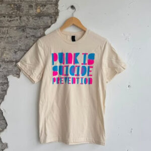
o celebrate PRFM entering into its third year in September we wanted to do another run of shirts. So why not freshen up the design a little. Design @adamdkearney Print @rezonanceprinting @garbagepailpapi Rezonance crushed it again. While redesigning the logo I wanted to capture the dissonance we are collectively feeling in the world right now. To capture that nuance, the crow was rendered with a circle halftone centred on its eye. While the moons circle halftone is centred in the middle of itself. Because these two points are misaligned a dissonance is created when the patterns are over lapped. To achieve this seemingly chaotic effect on a screen print requires true talent in the fine art of registration. Don’t worry there is a splash of traditional halftone dots in the type. If these are popular enough we may do a long sleeve run as well.
Reviews
There are no reviews yet.